Preferences Redesign
Too Many Emails

Project: Update the Notifications preferences page
Team: Product Designer, UX Researcher, Product Manager, Engineer
My Role: Sole Product Designer
Timeline: 8 weeks
Tools: Figma, Miro, Jira, Zoom
Overview
WP Engine is a premier managed WordPress hosting platform known for its reliability and performance.
However, there was a problem with setting up the notification preferences in the customer portal.
It didn't allow users to customize their email preferences efficiently, so users were receiving an overwhelming number of emails, leading to frustration and inconvenience.
User testing revealed significant usability issues.
The Users: Business owners | Developers | Agencies
Users expressed frustration over the flood of emails they received, causing them to ignore most of them.
Setting up preferences was confusing. They didn’t know the cards were clickable, and there were too many options with ambiguous labels.
One account owner said he would cancel his account if the problem weren't resolved quickly.

Before the redesign, here’s a look at the settings page
and what the users had to say about it.
“I’m getting hundreds of emails a day!”
“Why are these (cards) greyed out?”
“What do all these options mean?”
Pain Points
20% of customers were receiving thousands of emails a day.
Emails were going into spam folders and/or getting ignored.
Pendo data shows that users were abandoning the settings page.
The settings were frustrating users to the point of giving up.
Users were overwhelmed with the number of options.
There were numerous confusing options and ambiguous labels.

Problem Statement
WP Engine users are experiencing email overload; when they try to manage their notification preferences on the platform, they get frustrated by the overwhelming settings page.
How Might We
Simplify the page, improve interactivity, and make it easier to manage notification settings with more straightforward language.
Workshop
I had a workshop with other team designers to brainstorm ideas for the redesign.

We came up with several ideas and narrowed them down using dot voting.

Categorization by Features and Products: Organizing messages by features and products helps users quickly locate and manage their settings.
Categorization by Severities: Categorizing messages by severity allows users to focus on more urgent issues.
Frequency Settings: Users can choose how often they receive messages based on their preferences. This allows them to customize their communication needs to fit their workflow.
Visual Hierarchy: Create a clear visual hierarchy using distinct headings, icons, and spacing to differentiate blocks.
First Round
I started the redesign by focusing on simplifying the layout and improving functionality.
Each week I presented the latest version at our design critiques, actively seeking feedback for the next iteration.


Iterations

Maintaining Consistency
Throughout this process, I prioritized maintaining consistency with the overall look and feel of the portal, ensuring that the new design seamlessly integrated with existing pages.
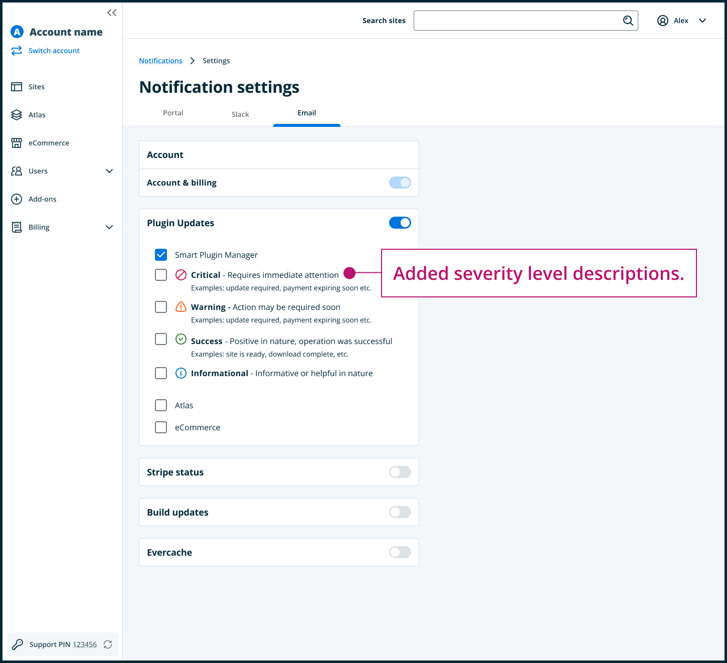
The screens below illustrate the iterative approach that enabled me to make incremental improvements, integrate valuable feedback from the team, and ultimately arrive at an optimized solution that matched our objectives for the settings page.


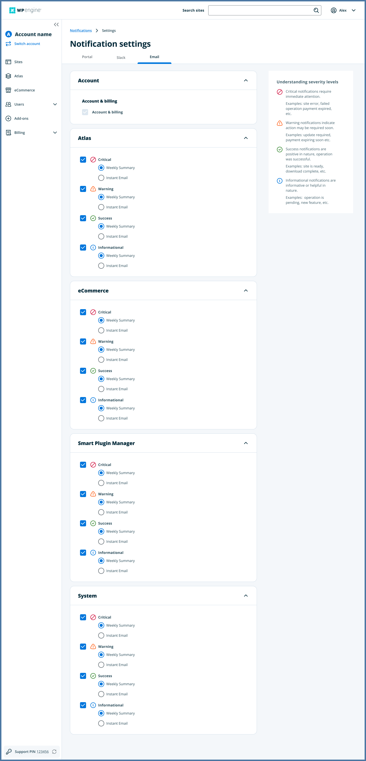
Deliverables🔥

Included in final designs

Before & After

Before

After
Results & Outcomes
Reduced daily emails by 70%.
Simplified the notification preferences page to make it easier and more intuitive.
Increased page engagement by 40%.
Increased customer satisfaction.
What I Learned
Thorough testing is essential for identifying user pain points, which helps create design solutions that keep the focus on the user.
Collaborating with stakeholders throughout the design process fosters valuable feedback and consensus, leading to better-aligned outcomes.
Project timelines and priorities can change, requiring designers to stay flexible and adaptable while maintaining high design quality.


